Monday, 22 April 2013

China & Hong Kong

In March I took a two week trip to visit Hong Kong and China. It was an amazing experience and I'm so glad I had my trusty camera to document it all...even if I did take a few too many photos.

Here are a few below from my time in China. I have lots more to edit from both China and Hong Kong so hopefully they will be up soon. 
Baby at work, Yangshuo

Countryside shot, Yangshou


Guillin Park in the morning

Bambo rafting, Li River

Dragon Bridge, Yangshou


Friday, 29 June 2012

Portugal snaps

Here are a few photos I took during a weekend break to Alvor in Portugal. 


Thursday, 28 June 2012

Portraits - Research

Rankin 

Rankin is famous for his portraits, shooting countless celebrities and in 2009 he shot 500 ordinary Brits (including my friend Jo, image below) in 20 days. I love the simplicity of his shoots, no fussy props just good old portraiture! 


Mario Testino

I like how Mario Testino (no introduction needed for this man!) has portrayed a sense of attitude in this shot by very small adjustments to the models face. Head up, eyes narrowed and lips open. In some of my shoots I will try and convey emotion like this.


PEROU

Perou is another famous fashion photographer. In the two images below I really like the use of the subject being side on and especially the shadow it creates on Daniel Craig's face. I also love the emphasis on Sienna's cheekbones, I will try and recreate this emphasis in my model (Helene) by shotting some shots side on.


Monday, 25 June 2012

Statement of Intent - Portraits

Candidate Name: Lucy Prosser
Theme: Portraits
Title: Helene

Portrait images

Intentions/purpose of the photography to be undertaken
To deliver a set of 10 natural portrait images of the chosen model Helene. I wanted to produce portrait photos that were relaxed and informal, stepping away from washed out backgrounds ala modern mass produced portrait photography.

Reasons for selection of theme (including inspiration from the work of others)
With a keen interest in fashion magazines and blogs, I am inspired by the endless collection of photos produced. The current trend for highstreet fashion magazines is a very natural laid back approach to images. My first idea was to shoot outside in the grass but I decided after looking at the British weather that this may not be possible!

The photo imaging equipment and medium that will be used and why & How light quality can be used to help convey the visual message
I will use a Canon EOS 450D camera along with my kit lens.
I chose to keep lighting to a minimum by shooting with two bulb lights either side and a softbox at the front to illuminate Helene. I experimented with how shots using a grid to create a more soft backlit image. 

I started my set up with two Bowens studio lights (750W) to give a simple light. I then used a softbox infront of Helene to soften the light that would fall on her to give the portraits a natural/soft finish. I experimented with the use of the grid on the Bowens light to the right hand side of Helene to give either a soft backlight or a harsher more concentrated light with the grid off.  In shooting portraits I wanted to create a good light from below Helene, this was achieved through the use of a golden reflector. 

The use of a beauty dish (seen below) helps light bounce off the dish's light surface giving an even and flattering lift to the subject. The dish also helps divert light away from the centre and helps eliminate hotspots and harsh shadows.  


Techniques that will be used and how they will help convey the visual message


All my images were taken in RAW format, meaning I was able to use Photoshop CS5 to post process certain elements of the images. Although my model Helene has a flawless complexion and great cheekbones I used various vanity techniques in Photoshop such as brightening of the eyes and removing fly away hairs against the background of the image. These techniques enabled me to present a more professional looking fashion photo for my collection. Using tools such as saturation and clarity let me bring an element of texture into the images. 

Safety considerations
I briefed Helene before the shoot to her let know it was a relaxed session and that she could take a break or sit down whenever she felt like it. I also warned her that I'd be using flash photography and asked her to cover her eyes each time I tested the flashes.

Whilst positioning the lighting equipment I made sure heavy equipment was carried by two people. All electrical equipment had been PAT tested by the College. 

Statement of Intent - Food

Candidate Name: Lucy Prosser

Title of theme: Food photography
Intentions/purpose of the photography to be undertaken:
I wanted to create a collection of images based around classic food photography. I wanted to ensure I incorporated a range of different styles into my collection from retail (yoghurt and Taboo images) to abstract (red cabbage shots) to classic food photography (peppers and strawberries)

Reasons for selection of theme (including inspiration from the work of others):
My inspiration to shoot food photography came from the various cooking books I own and the numerous food adverts that are shown on TV each day. I have always been interested in using photography to sell products i.e. with the help of photoshop making an image as atheistically pleasing as possible. in my research post I came across a number of different food photographers who covered the

The photo imaging equipment and media that will be used and why
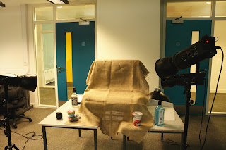
Due to shooting smaller items i used a lightbox table to shoot the items on. This meant assembling the set up through using a table to place the lightbox on and then arranging the lights to the right height. The image below shows one of the set ups used for the photography, I made use of a hesian sheet to give the background a rustic textured feel which is often seen in 'Homely' food photography shoots. 


The lighting set up was predominantly around the main spot light (seen on the top right in the image) then two smaller lights were used to highlight the fruit and veg.

I used three studio lights and a lightbox to create my images. I also used white boards to bounce the light off to centre the light on the fruit/veg. This technique was used the most in the images of the yoghurt pot to ensure a nice even lighting and to stop shadows being created.

In the red cabbage images I used a macro lens. The decision to use a macro lens was so I could focus on the abstract patterns within the cabbage.
All my images were taken in RAW format, meaning I was able to use Photoshop CS5 to post process certain elements of the images. The majority of tools used in photoshop were to highlight colour and texture. This was done by increasing the clarity in images and hue and saturation. 

How light quality can be used to convey the visual message

My aim is to create a number of clean and commercial veg and fruit images.This meant a number of lights were used in the set up with one main light used on the righthand side. Backgrounds were changed to bring a different feel to the images. A black background was used in my image of the peppers as the texture of a pepper if smooth and shiny, and the hesian background was too rustic for this.  therefore on most of the images only one light was used to give depth to the objects and to cast shadows. 

Safety Procedures

As I was shooting inside the photography classroom I made sure to warn others about my shoot and made sure my class mates were aware of the wires on the grounds and that I would be using flash photography.

All equipment used had been PAT tested by the College and was safe to use. 

During photo editing I made sure I took regular breaks from the computer to mimizie risk of eye strain.

All lighting equipment was weighed down and placed out of walkways/ people's paths.


Tuesday, 12 June 2012

Research - Food Photography


Marie Louise Avery - Food Photography

www.marielouiseavery.com


I love the use of a plain white background and positioning of the fruit and veg in the above images. Marie Louise approaches the shots with simplicity letting the produce do the talking. 

Charlotte Hurst - Commercial food photography

www.charlottehurst.com


In Charlotte's commercial work we can see how she has arranged the items to come across well aesthetically. The green in the strawberries is picked up in the green web tab. In the second image Charlotte's use of a glass teapot, cup and saucer means the tea does the talking. The inclusion of a model could have taken the attention away from the product but by only including the torso this is avoided.

Jean Cazals - Food Photography

www.jeancazals.net 


I love the rustic and DIY feel to all Jean's images. The second image above has no doubt be preened to perfection but by using crumpled paper and a cheesecake that is evidently homemade it brings a lot more texture into the image. the first image above uses a palate of brown colours which brings out the earthy colours of the Pomegranate. I love how Jean's work is not overly photoshopped his approach is clean, graphic and based on natural style. Jean says that elegant styling and food presentation are the most important parts to his photography. .

Thursday, 31 May 2012

Portraits

I've chosen portraits as my second theme for the studio photography course. After researching I decided I wanted to shoot some images with a fashion feel and dragged my friend Helene along to be my model for the night.