Showing posts with label Coursework. Show all posts

Thursday, 28 June 2012

Portraits - Research

Rankin 

Rankin is famous for his portraits, shooting countless celebrities and in 2009 he shot 500 ordinary Brits (including my friend Jo, image below) in 20 days. I love the simplicity of his shoots, no fussy props just good old portraiture! 


Mario Testino

I like how Mario Testino (no introduction needed for this man!) has portrayed a sense of attitude in this shot by very small adjustments to the models face. Head up, eyes narrowed and lips open. In some of my shoots I will try and convey emotion like this.


PEROU

Perou is another famous fashion photographer. In the two images below I really like the use of the subject being side on and especially the shadow it creates on Daniel Craig's face. I also love the emphasis on Sienna's cheekbones, I will try and recreate this emphasis in my model (Helene) by shotting some shots side on.


Monday, 25 June 2012

Statement of Intent - Food

Candidate Name: Lucy Prosser

Title of theme: Food photography
Intentions/purpose of the photography to be undertaken:
I wanted to create a collection of images based around classic food photography. I wanted to ensure I incorporated a range of different styles into my collection from retail (yoghurt and Taboo images) to abstract (red cabbage shots) to classic food photography (peppers and strawberries)

Reasons for selection of theme (including inspiration from the work of others):
My inspiration to shoot food photography came from the various cooking books I own and the numerous food adverts that are shown on TV each day. I have always been interested in using photography to sell products i.e. with the help of photoshop making an image as atheistically pleasing as possible. in my research post I came across a number of different food photographers who covered the

The photo imaging equipment and media that will be used and why
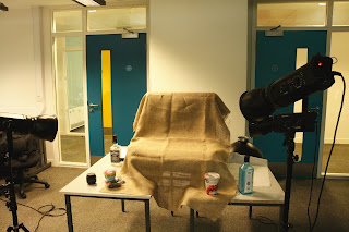
Due to shooting smaller items i used a lightbox table to shoot the items on. This meant assembling the set up through using a table to place the lightbox on and then arranging the lights to the right height. The image below shows one of the set ups used for the photography, I made use of a hesian sheet to give the background a rustic textured feel which is often seen in 'Homely' food photography shoots. 


The lighting set up was predominantly around the main spot light (seen on the top right in the image) then two smaller lights were used to highlight the fruit and veg.

I used three studio lights and a lightbox to create my images. I also used white boards to bounce the light off to centre the light on the fruit/veg. This technique was used the most in the images of the yoghurt pot to ensure a nice even lighting and to stop shadows being created.

In the red cabbage images I used a macro lens. The decision to use a macro lens was so I could focus on the abstract patterns within the cabbage.
All my images were taken in RAW format, meaning I was able to use Photoshop CS5 to post process certain elements of the images. The majority of tools used in photoshop were to highlight colour and texture. This was done by increasing the clarity in images and hue and saturation. 

How light quality can be used to convey the visual message

My aim is to create a number of clean and commercial veg and fruit images.This meant a number of lights were used in the set up with one main light used on the righthand side. Backgrounds were changed to bring a different feel to the images. A black background was used in my image of the peppers as the texture of a pepper if smooth and shiny, and the hesian background was too rustic for this.  therefore on most of the images only one light was used to give depth to the objects and to cast shadows. 

Safety Procedures

As I was shooting inside the photography classroom I made sure to warn others about my shoot and made sure my class mates were aware of the wires on the grounds and that I would be using flash photography.

All equipment used had been PAT tested by the College and was safe to use. 

During photo editing I made sure I took regular breaks from the computer to mimizie risk of eye strain.

All lighting equipment was weighed down and placed out of walkways/ people's paths.


Tuesday, 12 June 2012

Research - Food Photography


Marie Louise Avery - Food Photography

www.marielouiseavery.com


I love the use of a plain white background and positioning of the fruit and veg in the above images. Marie Louise approaches the shots with simplicity letting the produce do the talking. 

Charlotte Hurst - Commercial food photography

www.charlottehurst.com


In Charlotte's commercial work we can see how she has arranged the items to come across well aesthetically. The green in the strawberries is picked up in the green web tab. In the second image Charlotte's use of a glass teapot, cup and saucer means the tea does the talking. The inclusion of a model could have taken the attention away from the product but by only including the torso this is avoided.

Jean Cazals - Food Photography

www.jeancazals.net 


I love the rustic and DIY feel to all Jean's images. The second image above has no doubt be preened to perfection but by using crumpled paper and a cheesecake that is evidently homemade it brings a lot more texture into the image. the first image above uses a palate of brown colours which brings out the earthy colours of the Pomegranate. I love how Jean's work is not overly photoshopped his approach is clean, graphic and based on natural style. Jean says that elegant styling and food presentation are the most important parts to his photography. .

Thursday, 31 May 2012

Statement of Intent - Hands

Candidate Name: Lucy Prosser

Title of theme: Hands

Intentions/purpose of the photography to be undertaken:

To produce a collection of hand portraits from one model, capturing movement and positioning of the hands during the day in various different activities (drawing, golf, driving etc). The collection should show a 'day in the life' of a hand. The choice of model was my dad due to the texture and colouring of his hand. I decided early on in research that an aged hand would produce an image which had greater depth and shadow.


Reasons for selection of theme (including inspiration from the work of others):

When planning my 'Hands' theme I started researching images of hands taken by photographers which can be seen in my Hands Research post. After completing my research I decided the main focus of my theme would be detail in the hand using depth of field. This would maintain the focus of the image on the hand rather than the background. I decided to use one model and to   From looking at various images I decided to focus heavily on depth of field in my images. This would allow the viewer to focus in on the hands in the images and not be distracted by the background.

Planning my shoot:

Before shooting I drew up a list of potential shots which would involve movement and different lighting. The time of day was crucial, all shots had to be done around midday to get the best use of natural light during the winter period. I gave a brief to my Dad about what was expected from him as a model and to try and due to our relationship he was able to relax and ensure the images didn't come across as posed or too staged.

Techniques that will be used and how they will help convey the visual message:

The images will be a mixture of colour with varying saturation, sepia and black & white. In my decision to concentrate on depth of field I used my 50mm lens which gave me enough depth of field than my kit lens but enough of a wide lens compared to a macro lens.

Safety Procedures

As I was shooting both indoors and outdoors in a home environment i had to be aware of any potential health hazards such as things left on the floor or sharp objects left around the house. As I was using the same model throughout my project i briefed them on what type of photos I would be taking, what I expected from them and also to let me know if they would like to take any breaks during the shoot.

Equipment

As the images were natural and quite close up I did not need to make use of a tripod and took all the images handheld. Again as I shot all the images in natural light around midday I did not need to use an additional flash equipment.

With my current lens only going to f stop 3.8 I decided it was time to buy a prime lens. This decision was made due to the fact that a macro lens would be too detailed for this project. My aim is to focus on a whole hand, rather than the details within it. Having bought a 50mm lens I did some test shots to decide the range of on the depth of field that I would intend to use for my project.

Thursday, 1 March 2012

Presenting photo images


To present my collection of costal landscapes I have chosen to use a photobook. I looked through a few different presentation techniques such as individual printing, flickr, postcards and a scrapbook. I decided to go with a photobook as I wanted to have a permanent record of my work 


Why have you presented your work in this manner?
I decided to produce an Apple photobook due to the quality and simplicity of the book. I wanted my photos to do the talking which meant they were the focal part of the presentation .
I researched a number of different photo book providers and felt Apple was the best company to go with. Having edited all my photos on an Macbook Pro, I felt the images would be of maxiumum quality keeping to the same company to produce my photobook. Another reason I chose an Apple photobook was their key branding rule - Simplicity

Describe the process for presenting your work.
The process to make my photobook involved making the final selection of 10 images. I decided I wanted a mixture of wide angle landscapes next to standard size images. Once I chose my images I began to upload these via the online photobook software
I then moved on to deciding the order of the photos in the book. To give the book a uniformed feel. I evenly placed smaller images followed by double spread images. Unfortunetly some of my images were too large for the size guidelines of the booklet, however I made the decision to still include these images as I felt they still worked even at a slightly cropped size.

Describe other presentation methods considered and give a explanation for deciding against them.
I considered printing and mounting all my images but felt that as i have not mounted images this before, it may not have a had a professional finish. I decided a photobook would be a tidy and compact way of displaying all my images at one time. 

What health and safety considerations did you observe?
I decided to go with Apple to print my photobook as they are a professional company who print these books on a large scale. Due to the printing being done professionally i did not need to worry about injuries that could be occurred during the printing.
 

Wednesday, 25 January 2012

Planning of shoot (Pt1) - Landscapes

The planning behind my landscape shoots....part 1

1. Tripod 
A tripod was a must for my landscape shoots for a number of reason:
1) As I was using long shutter speeds on some shots a tripod helped keep my camera still when shooting to avoid camera shake.
2) As I was shooting on coastal cliffs in December/January the winds were quite strong at times. Weighing down my tripod ensured my equipment wouldn’t fall over and get damaged in the wind.
3) As my tripod also has a spirit level on it I was able to level my photos as much as possible whilst ensuring I got the height I needed in a number of shots.

2. Focal Point 
The main focal point of most of my shots is the sea, however this is viewed from different angles and heights.  The rule of thirds has come into play in my images by breaking up the photo into three different sections; land, sea, sky. To give a variety of images in my selection I have changed the focal point on some of the images through different lighting conditions and post processing by enhancing certain colours and textures. In the first photo in 'Landscapes - Theme 2 - Filey' I have focused on the colours at sunset, whilst in photo 4th photo I have framed the image through an old outhouse building window and kept the focal point on the ocean..

3. Natural Lighting 
I planned both my shoots in the afternoon to make best use of the lighting. My first shoot was shot around 1:30 – 3:30pm this gave a high sun in the sky, which gave intense lighting on the beach. I used this to my advantage and shot more beach images this day and used the bright blue skies to give contrast to the image.

Golden Hours - On my second shoot I planned to make use of the amazing sunsets that the North has been having over the past few weeks. Sunrise would have been a lot harder to achieve as it would mean a 5am rise due to sunrise currently being around 7:30am!   With the sun setting in the west and Filey being on the west coast it meant it would be setting over the land, meaning I would be able to capture it shooting towards Filey promenade from the cliffs.  The angle and colour of the lighting brought a new depth to the images and created amazing textures in the clouds and skyline

Monday, 23 January 2012

Landscapes - Theme 2 - Filey Coast

A few landscapes I took along the Filey coast at the weekend. Unfortunately it was high tide at 2:30pm which hampered my plans at taking some images from out on brig (I definitely did not want to get stuck out there with my camera!) so I stuck to the tops of the cliff. 


This image was taken as the sun was setting. As Filey is on the east coast the sun sets over the land rather than the sea. I took this image with my 50mm lens as it performs better in low light then my kit lens. I've lightened the image slightly in photoshop. There is a seagull in the left hand corner which I might attempt to erase.

This was taken on Humanby Gap which is a more enclosed isolated cove. It was taken around 2:30pm with an overcast sky. Because of this the sky is mainly white/grey and drains the original image so I have converted it to black and white to give the coastline more contrast against the sky and sea.

This is taken on the beach at Hunmanby Gap, again at just before high tide. I've played with the highlights and shadows in this image to add texture to the clouds and wake.


Thursday, 19 January 2012

Hands - images

A few from my hands project, taken with my new prime 50mm f/1.8  lens 


I've toned down the temperature of the last image with blue tones. The lighting during the shoot was from household lights which made the images very yellow. I'll continue to experiment with different tones in photoshop.

Wednesday, 21 December 2011

Inspiration - Hands

Galway. 1996. Man at a racetrack.
(Magnum Photos)

USA. New York. Long Island.
A baby's first five minutes, 
Port Jefferson. 
Mother holds her child's hand. 1959.
(Magnum photos)

JAPAN. Tokyo. Shinjuku. 
JR station morning rush hour. 1996.
(Magnum photos)

Monday, 28 November 2011

Hands

A shot I took of my boyfriend's hand in Copenhagen. This image started my thinking into taking shots of hands in every day positions (in Tom's case, drinking beer!). I will further explore this area for my assignment.

Monday, 7 November 2011

Theme - Country Landscapes

Putting some thought into my theme, I've decided I want to focus on country landscapes. Even though I moved to Manchester five years ago from a small village outside Leeds, I've always been fascinated with the countryside. 

Over the weekend I bought a tripod as this is one of the key pieces of kit for landscape photography. This should help with long exposures and wide angle shots. Below are a few trial images with my new tripod (I was even adventurous and jumped into the stream to take a few snaps)


The image I have taken above is a prime example of an over exposed skyline. To help tackle this problem I'm going to experiment with filters over the coming weeks to see how different filters will effect certain shots, depending on lighting and composition. 

The last one is just for Dave...an Alpaca


Monday, 17 October 2011

Landscape - Otley Chevin

This week's assignment was landscape photography so I decided to pop back over the Pennines to my homeland...Yorkshire.

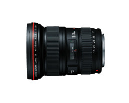
I took fellow class mate Darren the Pirate's advice and rented a lens from Lens Pimp for the weekend. I have to admit I know NOTHING about lenses, but Adham was answered my email was very helpful and pointed me towards the Canon EF16-35mm f/2.8L II Lens, which is a wide angle lens suitable for landscapes.


Having ordered the lens on Thursday morning it arrived first thing Friday morning and I was ready to start shooting. I'd definitely recommend the service to anyone who wants to try before they buy.

The plan was to get up early on Sunday and catch the sun rising over Otley Chevin...however due to a broken alarm clock I got there just to catch the last of the red sky!


Thursday, 6 October 2011

Inspiration

On Tuesday night we were asked to start thinking about our themes for our portfolio projects. We need to make a choice of two out of the fives themes that were given, which include portraits, nature and documenting an event.

My first thought was portraits. I'd really love to develop my portrait photography skills and this is a great chance to get started. I've had various ideas which all revolve around the same theme - Natural. I don't want posed airbrushed images, I want to capture the face in a natural expression. Whether this be laughter, sadness, shock, bewildered or even a sneeze...I think photographs that have movement in the face created an added depth to the image.

Inspiration
(I'll keep adding to this post as the week goes on)

John Madden aged 57 - Photo by Michael O'Brien


Part of the underground series - David Solomons

Tate Modern - Matt Stuart